WEB REDESIGN
Case Study: Business School
| The school for professionals, by professionals.
The school for professionals, by professionals.
MY ROLE
- UX/UI Designer
- Project manager
YEAR
2021-2022
CLIENT

Overview
User-centered website redesign for a business school located in Galicia with the aim of reinforcing the brand’s positioning. The visual design has been modernized to fit with its corporate vision and brand identity.
A new clear and intuitive navigation has been defined targeting different user profiles: recent graduates, young professionals, executive profiles, and in company education.
To fulfill the main users’ need (get information and contact):
- The valuable content has been scaled up..
- The presence of call-to-action has been increased.
- Trust elements have been added such as: student testimonials, certifications, an increase of presence of faculty members…
Solution
Process
Design Thinking methodology
1. Discovery
Initial audit
The first step of this project has been to carry out a thorough review of the website to:
- Detect usability errors.
- Review navigation.
- Spot design problems.
- Make a list of improvements and/or recommendations.
- Gather doubts and questions that came up during this process.
Discovery questionnaire
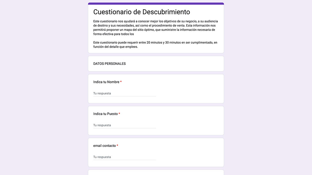
Questionnaire made in Google Forms
Interview with stakeholders
Once the questionnaire was completed, the information was processed and new questions arose. We set a date for a remote discovery meeting with the company director and members of their marketing team with the purpose of:
- Recognizing and defining the target audience and their goals.
- Identifying the business objectives.
- Identifying the unique advantages and strong points.
- Clarifying concepts about the company and its services.
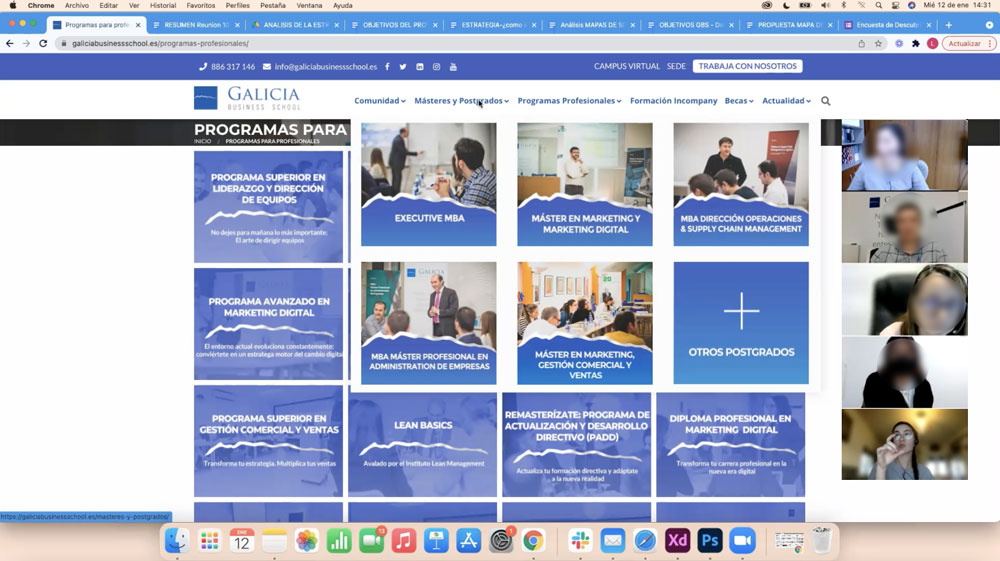
Meeting via Zoom
Business goals
My main goal as a UX Designer is to act as an intermediary between the business’ desires and the users’ desires. For this, it is of utmost importance to have both clear. In the meeting we had with the client, we were able to explore their vision firsthand and we were able to synthesize the business objectives that I present below:
- Goal: Lead Acquisition
Use the website as the main tool to acquire new leads and provide confidence to close the % of sales. (Their main lead acquisition method was word of mouth)
- Goal: User-Centered Focus
Focus the website’s content to direct their services (educational offering) depending on the needs of different profiles of potential students.
- Goal: Brand Presence
Reinforce the brand presence according to their vision: they are “the school for professionals and for companies that want to have a real business education” and provide a modern and professional visual appearance.
Competitor analysis
The next step was to make a comparative analysis. The analysis included the main business schools in Spain, both direct competitors and other renowned schools with similar objectives.
The analysis consisted of reviewing their websites, analyzing key pages, and, above all, questioning why certain sections were constructed the way they were. This helped us identify strengths and relevant aspects to understand and highlight what type of information users are seeking.
In addition, the visual and design aspects of the websites were analyzed, which allowed us to draw inspiration from different ways of presenting content.
2. Definition
User persona
To define the different user profiles, we relied on desk research. Based on the information provided by the client and quantitative data extracted from web analytics, we were able to identify 4 types of profiles: Recent graduate, Young professional, Executive professional, and Company training supervisor.
Defining user personas for the business school has helped us to:
- Encompass the different types of users that the business school has.
- Identify the different needs and pain points of each user.
- Keep in mind the different types of users when creating content tailored to their needs.
User journey
To empathize even more with our Personas, we established a User Journey Map. In this way, we were able to graphically identify the different stages that each of our users goes through, their emotions, needs, and pain points in each of these stages. It has also helped us reinforce the hypothesis of which are those key pages for users that needed more attention in this web redesign process.
Empathy map
3. Ideation
Re-defining the problem
Our client is a professional business school oriented towards the vast enterprise world. Our client required a professional website that reflected who they are and clearly highlighted the educational programs focused on their different target audiences.
Achieving intuitive navigation, and focusing on the user, was essential for a company that intends to make it clear that they are not just any school, thanks to their “from professionals, by professionals” orientation and their teaching method based fundamentally on practice.
Solution brainstorming
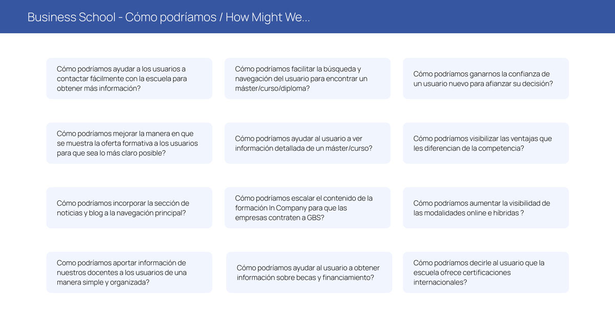
· Workshop: How Might We...
To activate our creative thinking and generate a brainstorm of solutions, we carried out the “How Might We…” exercise, which helped us to reframe our ideas and generate new ones on how to implement possible solutions to the main problems we face, such as Navigation, trust, contact…
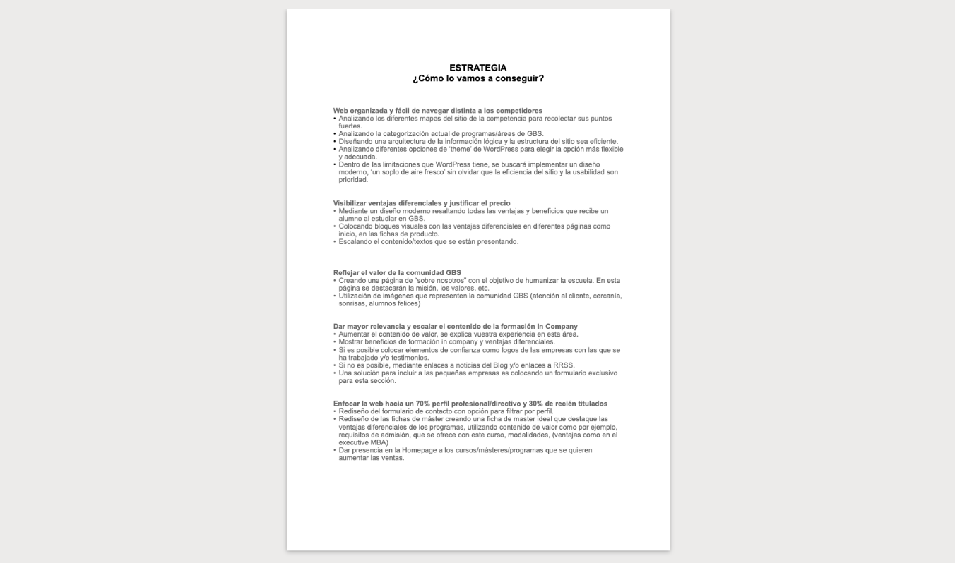
· Strategy sheet: ¿How are we going to achieve it?
User flow
Information arquitecture
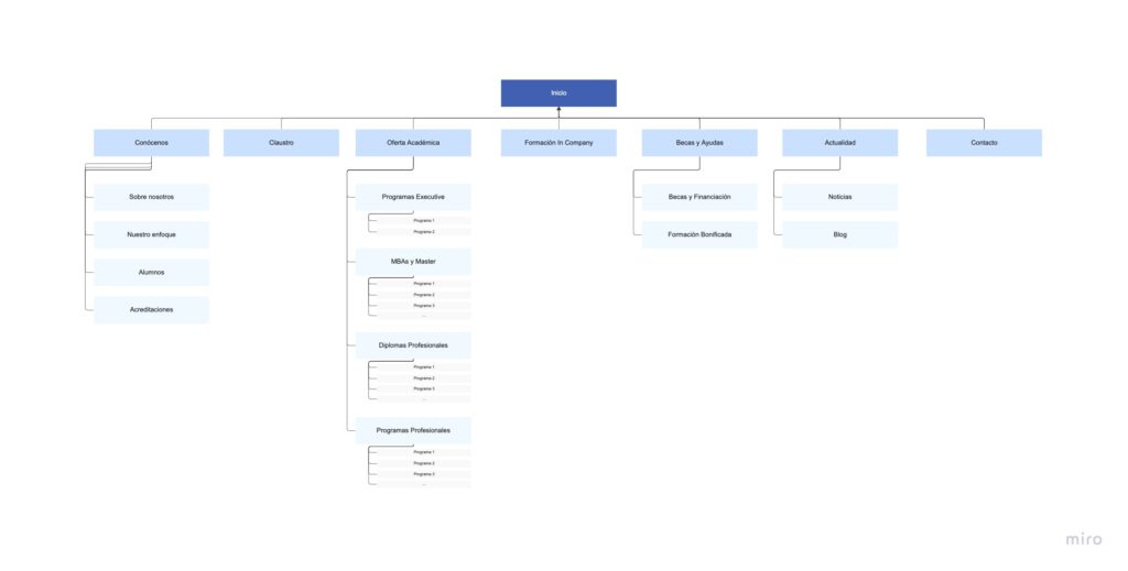
The next step in the process was to define the site map having the main goals in mind: visualizing the scope of the redesign of this website, being able to identify those key pages, and making the navigation of our users as easy and intuitive as possible.
The challenges in this phase were:
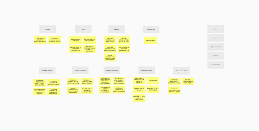
- Grouping the educational offer according to the client’s internal categorization and aligning it with the way our users search for information.
- Defining those main sections in the navigation to provide the necessary relevance to facilitate the “task” of each of our user profiles.
To achieve this, we carried out Card Sorting grouping exercises, different site map drafts, and validations with the client to reach a structure that we consider balanced for both the business and users.
4. Prototyping
Low Fidelity wireframes
For this project, initial sketches or wireframes were created to visually establish the structure and organization of the elements that needed to be included on each page.
The creation of these low-fidelity wireframes helped us to:
- Determine where the content blocks would be placed (to later request it to our client) and ensure that it followed a logical order and was in line with the user’s objectives.
- Carry out an internal validation with the design team to detect errors and iterate in the arrangement of elements.
Mid-Fidelity wireframes
After iterating and validating the low-fidelity wireframes, we gathered the most important insights to apply them to the medium-fidelity wireframes. This time, the goal was to:
- Further refine the structure by placing the sections of the main pages (which we called key pages).
- Make sure that the elements told a story to maintain a smooth navigation and guide the user to their final goal.
As this was a low-budget project, we agreed with the client that they would be responsible for writing the content. Therefore, the medium-fidelity wireframes helped to convey the information and make it easier for the client to visualize the text blocks and their length.
High Fidelity designs
The challenge
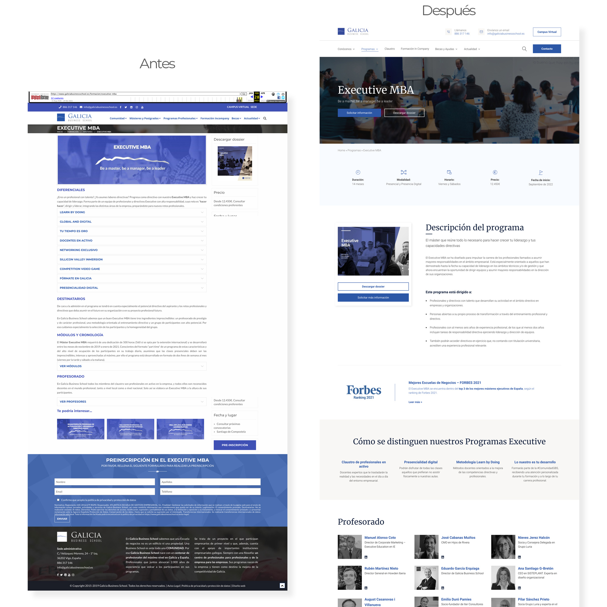
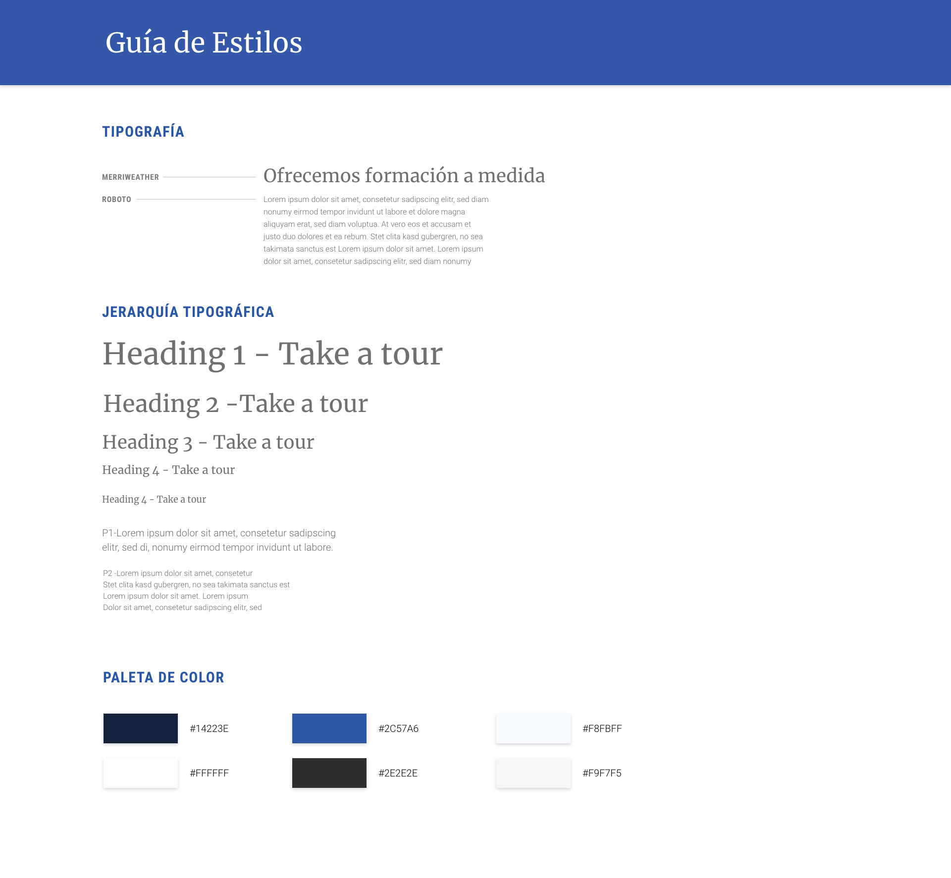
One of the client’s objectives was to modernize their website and have a look and feel consistent with their corporate identity. We faced the following challenges:
- The previous website lacked graphic consistency.
- It did not have a distinct personality.
- Elements such as buttons, typography, spacing, etc. were neglected.
- Outdated images were used without a logical justification.
Style guide
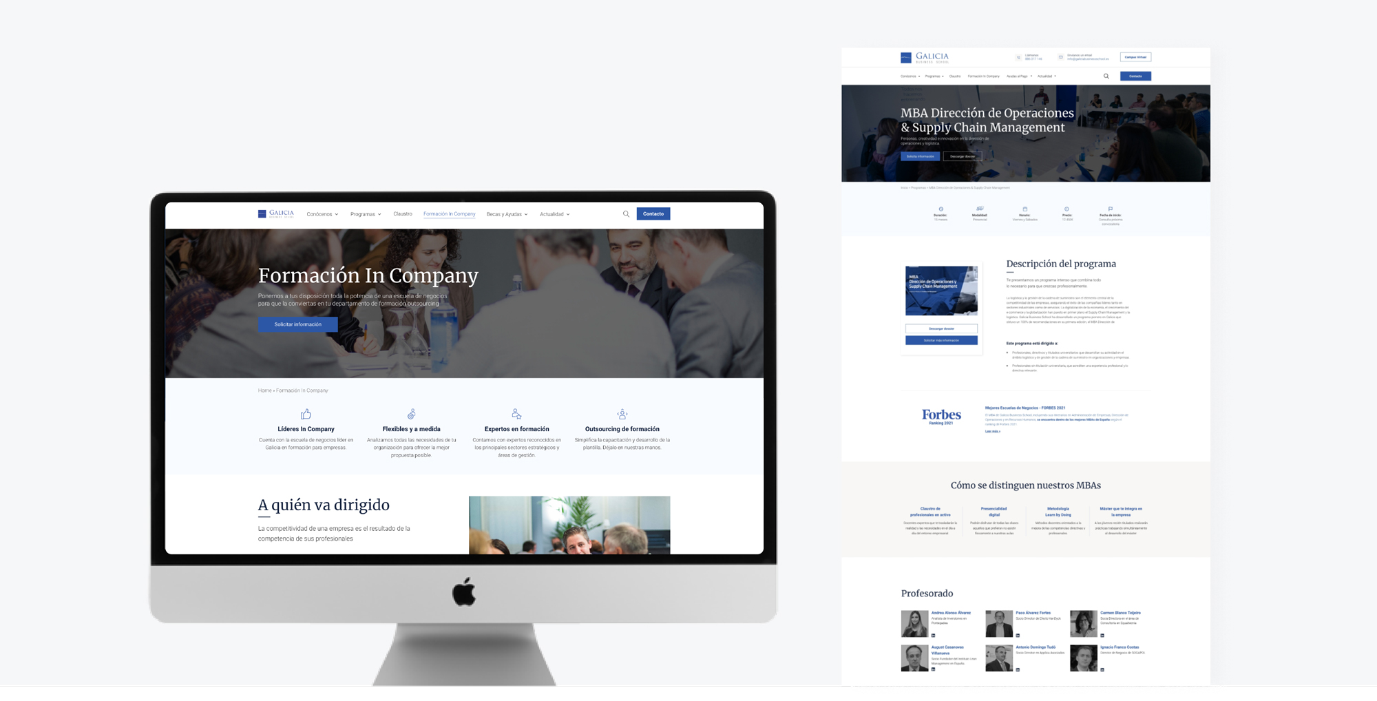
Screens design
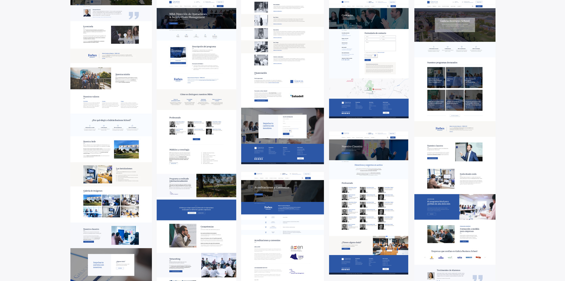
WordPress layout
5. Testing
Testings, iterations and launching
Moving on to the last phase of the iterative process, various testing was carried out.
- Layout testing was performed to verify that the design validated by the client was being followed and to test responsive behavior.
- SEO revisions were conducted to check titles, meta descriptions, image optimization, redirects, etc.
- Internal pre-launch testing was performed to identify usability, layout, navigation errors, and other issues.
- Client testing was conducted to perform the final validation before launch.
Finally, the necessary changes and adjustments were made to each of the revisions and testings of this phase to be ready for launch. Once the website was active and running, further testing was carried out to identify anomalies or small errors to be corrected.
Result
Before & After
