CONTENTS
- PROCESS
CASE STUDY: UX REDESIGN
Paint Ecommerce
Your online store to buy paint.

Overview
Our client: a paint store based in Galicia, Spain, needed to migrate their PrestaShop online store to a custom development. The main goal was to improve the user experience and optimize conversion by identifying obstacles and pain points in the purchasing process.
For this project, we followed the Design Thinking methodology to have a user-centered (UX) approach. We conducted thorough research, including searching for the most common terms and site metrics in Google Analytics, creating a user flow, user persona, wireframes, and high-fidelity mockups.
MY ROLE
UX/UI Designer
Project manager
YEAR
2022
KEY SKILLS
UX Research · Information architecture · User flow · CRO · UI Design · Testing
CLIENT
Pinturas Proa – pinturas.es
Solution
Process
Design Thinking methodology
1. Discovery
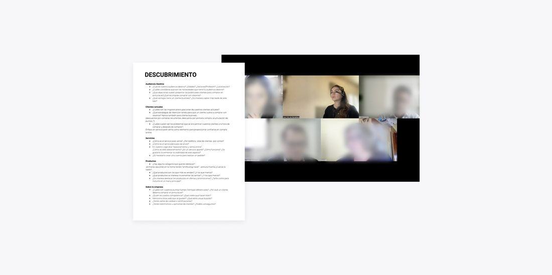
Stakeholder interview
This initial meeting has allowed us to learn about our client’s expectations and goals. Additionally, we were able to better understand their vision of their users’ needs, which has helped us design a more effective user experience. It has also been an opportunity to identify limitations and resources available for the project and establish an initial planning.
Defining business goals
Processing the information gathered in the meeting with the stakeholders has been very useful for the Pinturas.es redesign project. This way, specific and concrete objectives have been extracted for the development of the online store, such as:
- Increase conversion rate.
- Give greater visibility to metal and nautical paint.
- Offer a complete and intuitive categorization for the different types of profiles.
- Increase the presence of online support/guidance.
- Upgrade website image, modernize the design.
- Acquire professional-type leads.
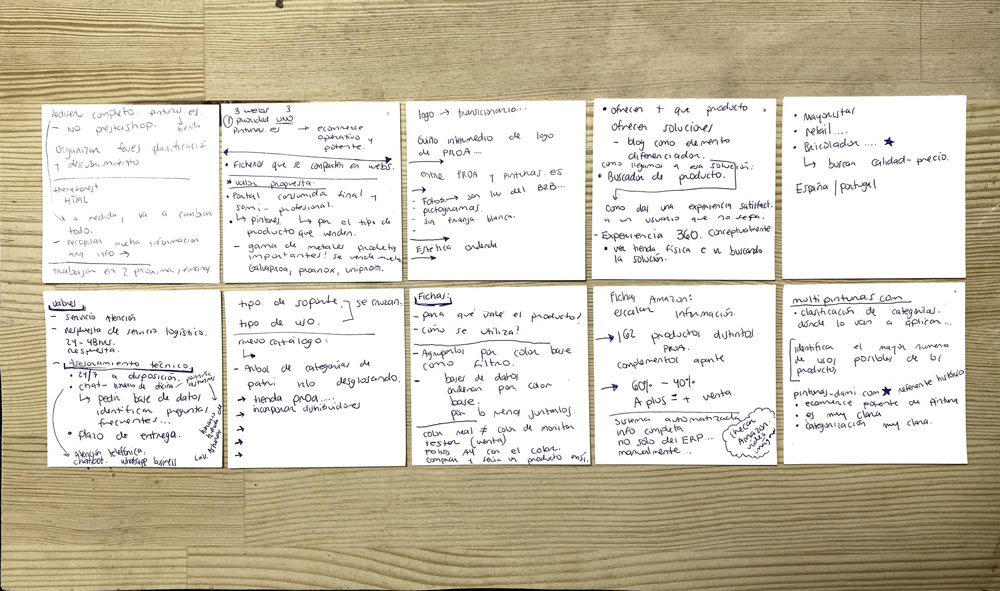
Competitor analysis
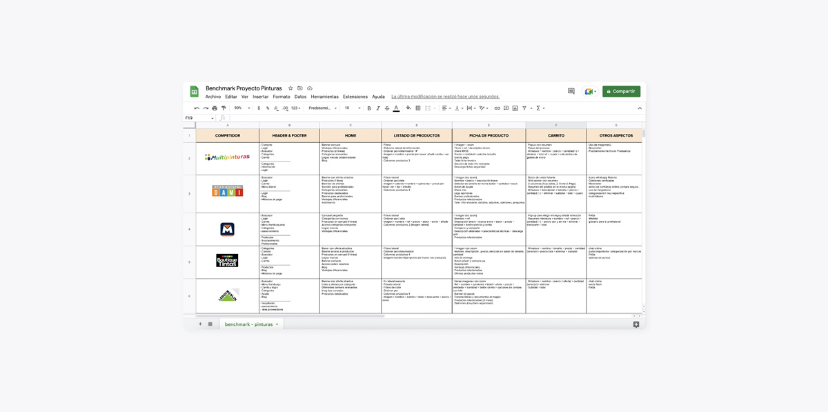
We conducted an analysis of our client’s main competitors to better understand the market, identify strengths and weaknesses. We obtained valuable information about how they present categorization, their products, and prices in order to have a complete vision and find opportunities for improvement and differentiation for our client’s online paint store.
2. Definition
User persona
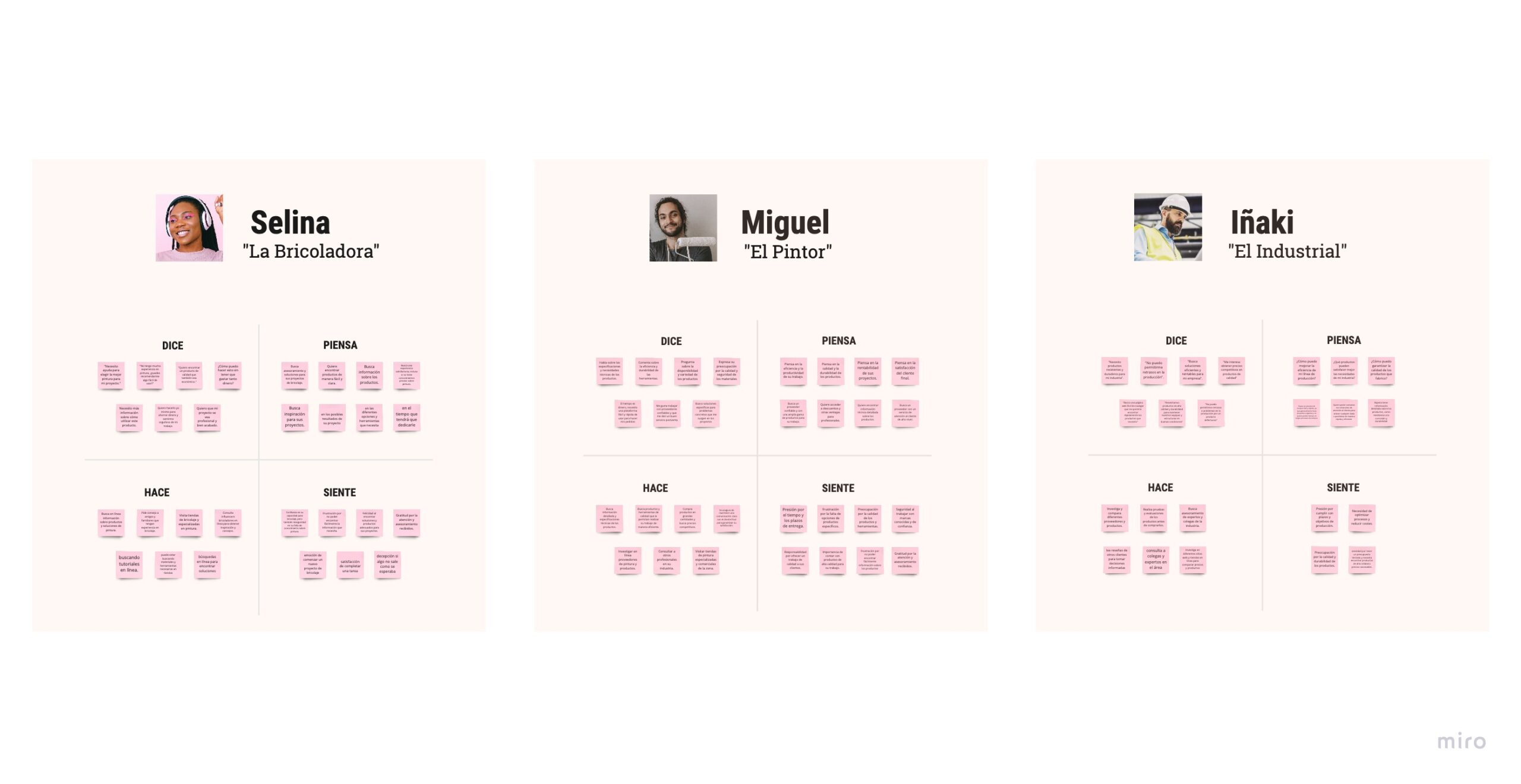
We have created a user-persona scheme to better define and understand our potential users. By creating a profile for each of these three types of users identified (DIYers, professionals, and industrial users) we have been able to identify their needs, objectives, frustrations, and preferences. This has helped us design a user experience focused on their specific needs.
Customer journey
Creating a Customer journey map has allowed us to visualize the buying process from the customer’s perspective. We were able to understand and identify actions, pain points, emotions, and key moments where the customer may feel frustrated or abandon the buying process.
Empathy map
Creating an empathy map has been very helpful in better understanding the needs, motivations, and frustrations of different user profiles. By putting oneself in the user’s shoes, it has been possible to empathize with their needs and understand their behavior when interacting with the online store, and to define viable solutions to improve their shopping experience.
Defining the problem
The main problem with the paint e-commerce site was the difficulty users had to find the products they needed due to the lack of a logical and easy-to-use categorization system. Additionally, the product descriptions were insufficient and did not provide enough information to help customers make informed purchasing decisions.
3. Ideation
User flow
By identifying the different customer profiles and their needs, we were able to establish a logical and coherent path in their purchasing process. This allowed us to identify potential obstacles in navigation. Additionally, the user flow also enabled us to focus on the actions and decisions that the user needs to make to successfully complete their purchasing process, and thus ensure that the website fulfills its main objective: converting visitors into satisfied customers.
Information architecture
The lack of a logical categorization made searching hard and caused confusing navigation. To solve this problem, we conducted research on term searches using Google Analytics and Ubersuggest. We also analyzed the competition to help us establish a new, intuitive categorization system. The goal was to design navigation with all different user-persona profiles in mind so that customers from any sector could easily find the products they needed.
Analyzing metrics
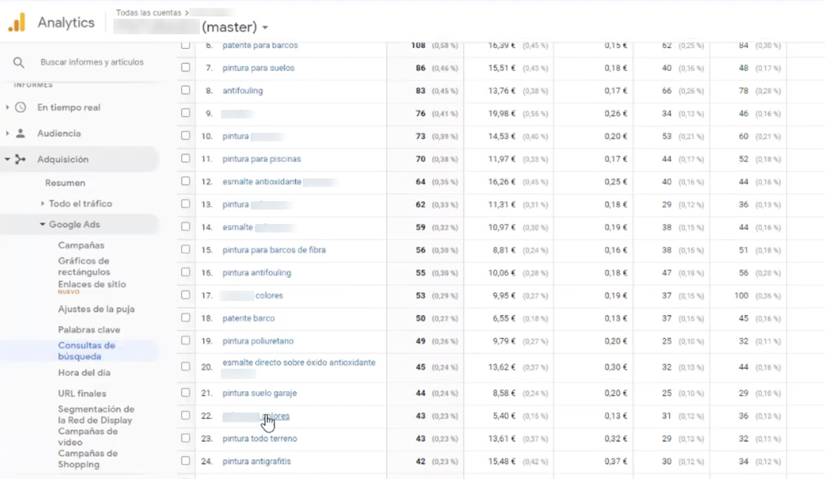
Google Analytics was a valuable tool for the project, as it allowed us to analyze search queries, the most searched terms, the most visited sections and products. We were able to identify user behavior patterns and better understand their needs in order to optimize navigation.
Search terms
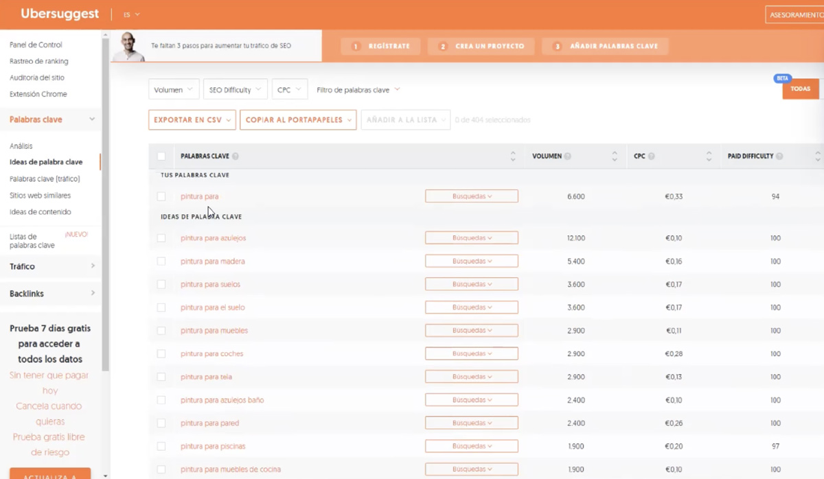
The Ubersuggest tool was very useful, as it allowed us to know the most common and searched terms about paints and make sure that the terms we used were really relevant to our users and having in mind the SEO.
Sitemap
Creating multiple versions of the site map based on search and term research was essential for defining navigation. By having diverse options and perspectives from team members, we were able to explore different possibilities for categorizing and structuring information to find the most logical and user-friendly one. This allowed us to ensure that site navigation was clear, simple, and efficient for users.
4. Prototyping
Wireframes
In the next stage, key pages were selected to create low-fidelity wireframes and Hi-Fi mockups. These elements allowed us to have a clearer understanding of the site’s structure and visual design, enabling us to make any necessary adjustments before sending it to layout. Additionally, we also used these designs to present the proposal to stakeholders and make sure that they were aligned with their expectations.
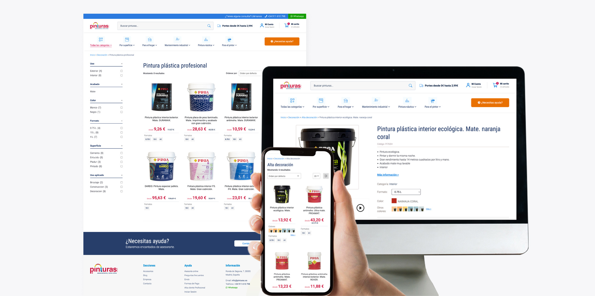
Product page
Designing an “ideal” product page helped us with the layout of elements such as basic product information, color selector, price, and purchase buttons. We were also able to evaluate different design options for the lower section of the page to shpw technical and valuable information about the product and create an efficient shopping experience for the user.
High fidelity designs
Moving on to designing high-fidelity mockups to provide a preview as close as possible to the final product. In this stage, the elements that were a significant challenge were: the use of color and images. The client not only wanted to redesign the website but they also modernized its image by updating its logo. Several color tests were carried out and were validated within our team and with the client as well.
Style guides
Our client did not have a defined corporate identity manual, they simply provided us with the new logo. Which meant we had the freedom to choose the styles to use on the website, including typography and colors. The chosen color palette was based on the colors of the logo. The challenge was: to use the color red with caution, because is not an easy color for usability and readability purposes.
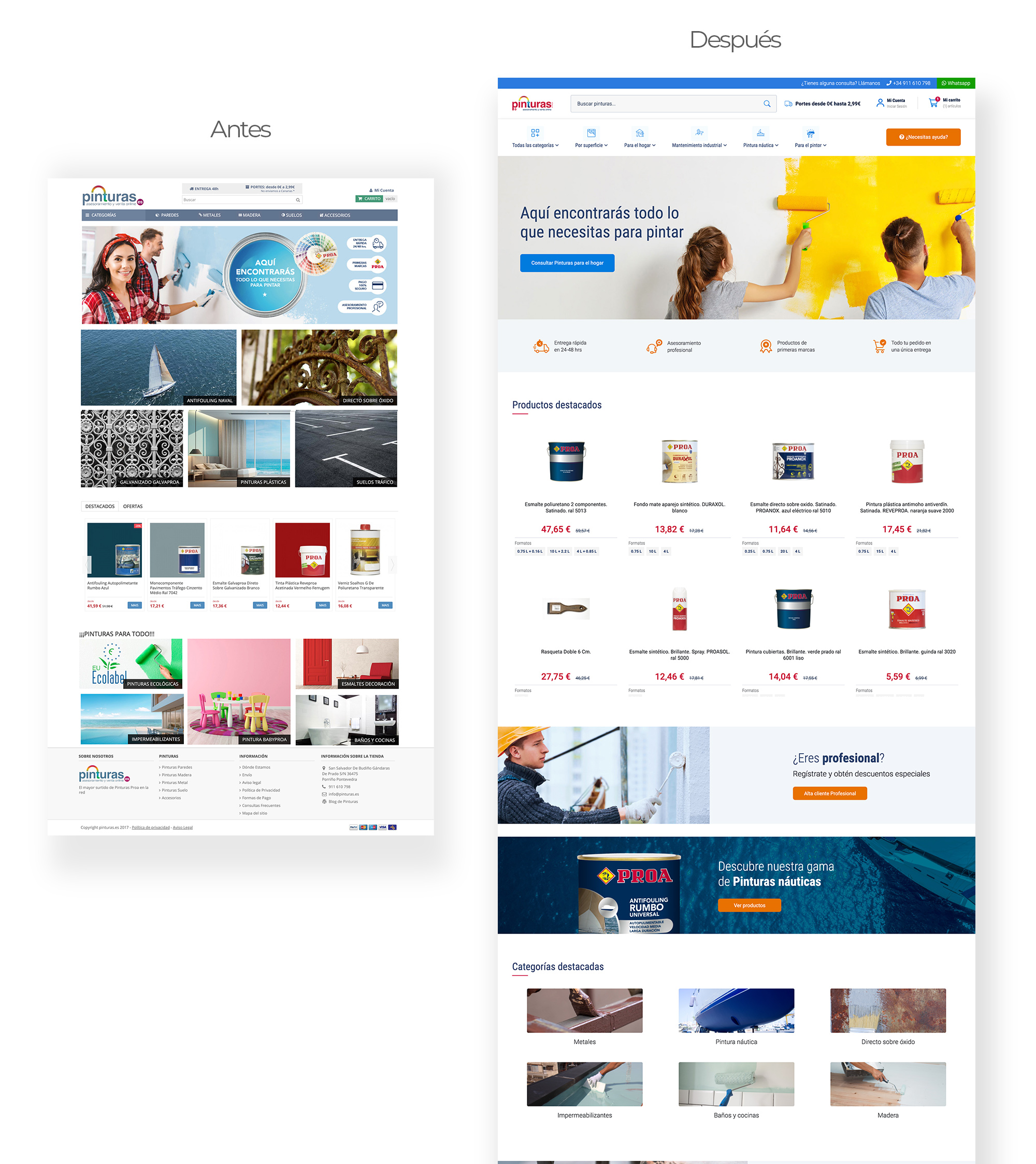
Homepage mockup
In the process of creating high-fidelity mockups for the homepage, there was a need to showcase the most important products, increasing the relevance of nautical and metal paints. In addition, it was decided to include customer testimonials and the differential advantages of our cliente’s online store.
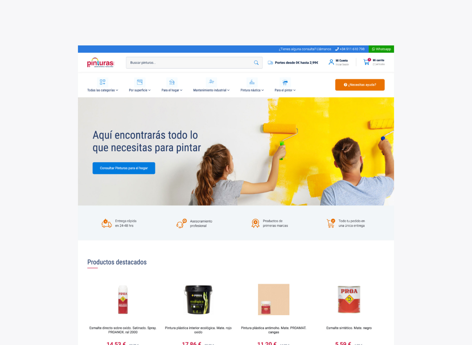
We carried out several color tests for banners, with the aim of selecting the appropriate palette that would convey the essence and personality of the brand, generating visual impact and achieving an emotional connection with the user. In this way, an attractive and functional homepage was created that improved navigation, identification of relevant productos and the overall user experience.
Category page mockup
The challenge has been to visually present the wide categorization of products on the “category” pages and make a coherent selection of images that must represent the category to which they belong and also be attractive to the users to keep them engaged.
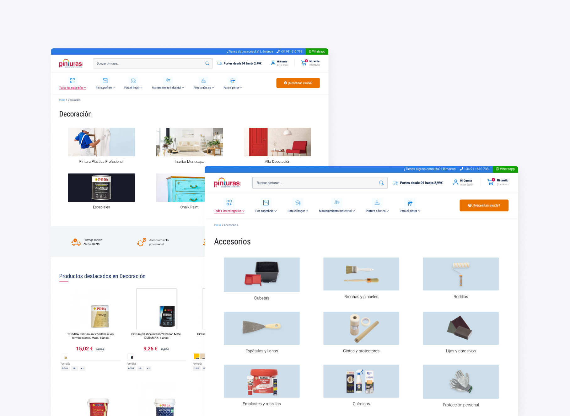
Product details mockup
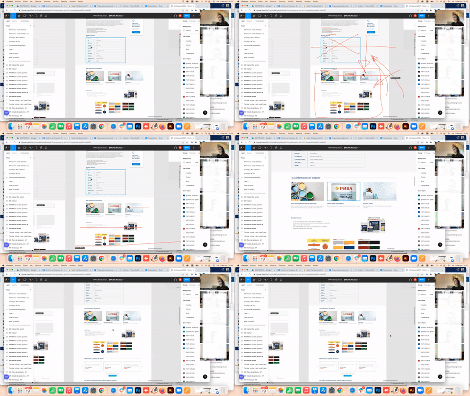
Creating the product page mockup allowed me to establish a specific style for certain elements. For example, tables used to display technical product information, which is especially important for industrial-type users who need accurate information about the products to make purchasing decisions. In addition, the use of different colors and proper differentiation of sections as the user scrolls makes the product detail page easy to read and improves the user experience.
5. Testing
Testings, launch & monitoring
Once the design process was validated, we passed them on to the development team that executed the layout of the screens in a testing environment. Then we moved on to the review and testing phase to guarantee the quality and effectiveness of the site in order to detect and solve any possible error or failure in the user experience. Once the review and testing process was completed, we proceeded to launch.
Hotjar
Analysis and monitoring sessions of user behavior on the site were carried out through Hotjar tool. Thanks to this, we were able to identify errors and impediments when proceeding with purchasing any item.
Analytics
3 months after launching, we did monitoring sessions within the site’s analytics to see the performance and results of the project. We can see that the conversion rate increased by more than 60% than the previous year.
Conclusion
Our team came up with a scalable and personalized e-commerce, designed to provide an optimal user experience, increasing customer satisfaction and increasing conversion rate of the site. Through an analysis of each user profile needs, it was possible to: improve site’s navigation, quality upgrade in the valuable content of the product detail pages and the implementation of a predictive and efficient search engine.
Result
Before & After
