Home / UX/UI
UX/UI Projects
Take a look at my featured case studies to learn about the process I follow when creating digital projects.
Project archive
UX redesign for paint manufacturer corporate web
- Company: Industrias Proa
- My Role: Project manager · UX/UI Designer
My goal has been to coordinate and implement a user-oriented UX approach to this custom-made corporate website. I carried out activities such as communication with stakeholders, information architecture, wireframes, Hi-Fi designs, coordination with front-end outsourcing, development handoffs…

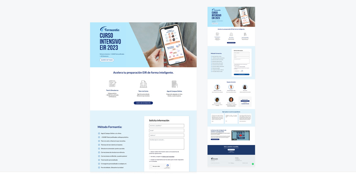
Landing page design for nursing competitive exam course
- Company: Formantia
- My Role: Project manager · UX/UI Designer
I was responsible for creating a landing page to request information about the EIR intensive course, where I established a conversion-oriented structure, a visual design that aligned with the corporate style, and coordinated with the development team to execute it in HTML and CSS, ensuring that it was responsive for mobile versions.
WordPress web redesign for Media Agency
- Company: Calena Media Agency
- My Role: Web Designer · WordPress developer
I performed a complete redesign, including rebranding, design, and developed website’s layout on WordPress, scaling from a one-page to creating new sections. I applied a UX approach: structure and content tailored to the needs of the target audience, correction of usability issues, and increased presence of CTAs.
One-page web design for Security Counseling company
- Company: Framework Partners
- My Role: Project manager · UX/UI Designer
My main goal has been to create a logical structure based on the objectives of this newly created one-page website. CTAs were added in strategic locations, I implemented a consistent visual design by selecting typography, colors, and images that align with the corporate style, and coordinated with the development team to execute it in WordPress.
Landing page optimization for self-storage company
- Company: RedTras
- My Role: UX/UI Designer
The client needed to optimize their landing page aimed at acquiring partners, so I was in charge of creating a conversion-oriented structure. I conducted a brief benchmark to identify the strengths of the competition, added new content blocks highlighting differential advantages, and placed CTAs in strategic locations.
Usability audit + UX design for kitchen furniture store
- Company: Santos Vaguada
- My Role: UX/UI Designer
A usability audit and UX review of the website were conducted to identify obstacles and propose improvements. A partial redesign was carried out with the objective of establishing a new order and facilitating user navigation. I designed wireframes for key pages such as showroom, prescribers, projects, and “in the media”
CRO & web optimization for heating systems company
- Company: Hidalgas
- My Role: UX/UI Designer
To recover the conversion rate percentage, modifications were implemented to encourage budget requests. We increased the visibility of immediate contact elements and CTAs, highlighted the differential advantages, made corrections to improve readability, and once the changes were implemented, we monitored them in Hotjar.
Visual design for concrete plunge pools web
- Company: Tecpool
- My Role: UI Designer · WordPress developer
I have created the visual design for this WordPress website, using the corporate style to create high-fidelity mockups for the home, category, product sheet, contact, and blog screens. I also worked as a Junior WordPress developer using Elementor.
WordPress Web Redesign for Health Coach
- Company: Katty Bon Health Coach
- My Role: Web Designer · WordPress developer
My goal in redesigning the visual interface and developing this WordPress website was to scale up the valuable content for users, optimize SEO-friendly content using keywords, establish consistency in typography hierarchy, improve the blog, correct usability errors, and make the website more contact-oriented.
UX Web Redesign for Marketing agency
- Company: Muchas Metas
- My Role: Project manager · UX/UI Designer · Junior Front-end Developer
UX redesign to make the website more contact-oriented, with the aim of scaling up valuable content and presenting different services they offer. We optimized the blog and improved the visual interface to modernize the corporate image and convey trust. I also coordinated the execution and development, and assisted in front-end layout in HTML and CSS.
Discover my expertise in other fields of design.
Graphic design · Illustration · photography · film & TV


