WEB REDESIGN

Case Study: Renovations Studio

| Kitchen furniture and home renovations.
Kitchen furniture and home renovations.

MY ROLE

  • UX/UI Designer
  • Project manager
  • WordPress Front-end

YEAR

2022

CLIENT

Overview

This project has consisted of a complete redesign of the corporate website of a kitchen sales and home renovation studio. The main objective of the site is to promote our client’s products and services and improve the user experience by increasing the valuable information, offering clear navigation, and therefore increasing conversions.

A process based on the Design Thinking methodology was carried out to identify user profiles, from those looking for products and services for their home, to professionals who are looking to offer high-quality products to their own clients.

Solution

A corporate website with a new intuitive and easy-to-use navigation has been created, where the implementation of user-based solutions has been key in redesigning this site.

A clean design has been used to ensure that users can quickly find the information they are looking for about the products and services offered by the business.

New sections were added to improve the user journey and facilitate the user’s ability to achieve their goals and, above all, to contact the business.

Process

Design Thinking methodology

1. Discovery

Initial audit

The first step in the project was to carry out a usability audit of the client’s corporate website. This analysis revealed a number of issues affecting the user experience. We could identified problems such as:
  • Lack of valuable content throughout the site
  • Poor legibility due to a lack of typography consistency.
  • Lack of appreciation of the brand’s differential advantages.
  • Lack of calls to action to guide the users.
  • Unoptimized and low quality images.
  • Confusing navigation.
  • Missing of relevant pages such as ‘Our Projects’.
grafico usabilidad proyecto reformas studio
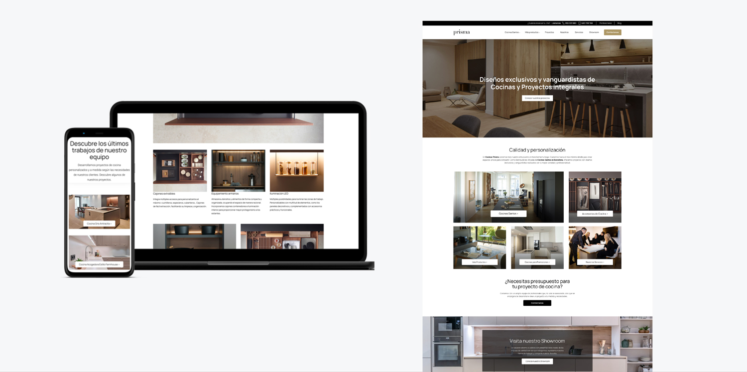
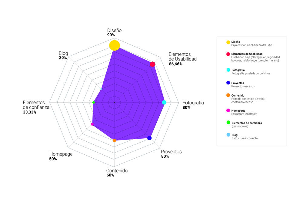
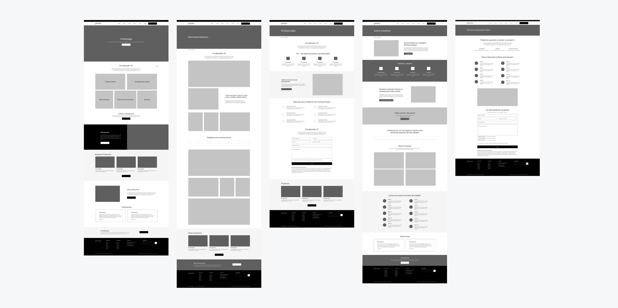
These problems caused a decrease in the website effectiveness and make it difficult for the user to make decisions, which is why it gave us a starting point to find solutions and tackle these problems.

Discovery questionnaire

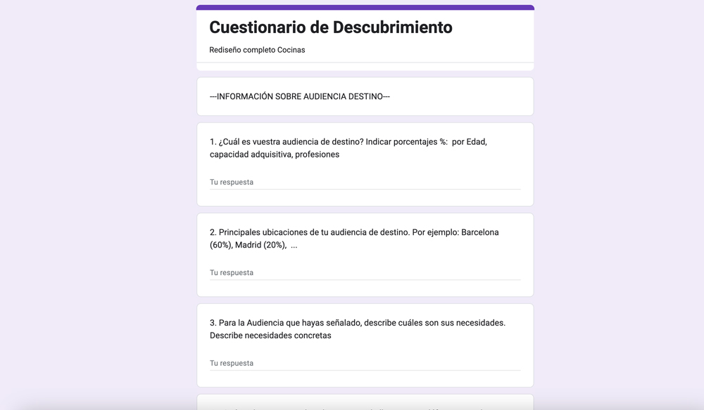
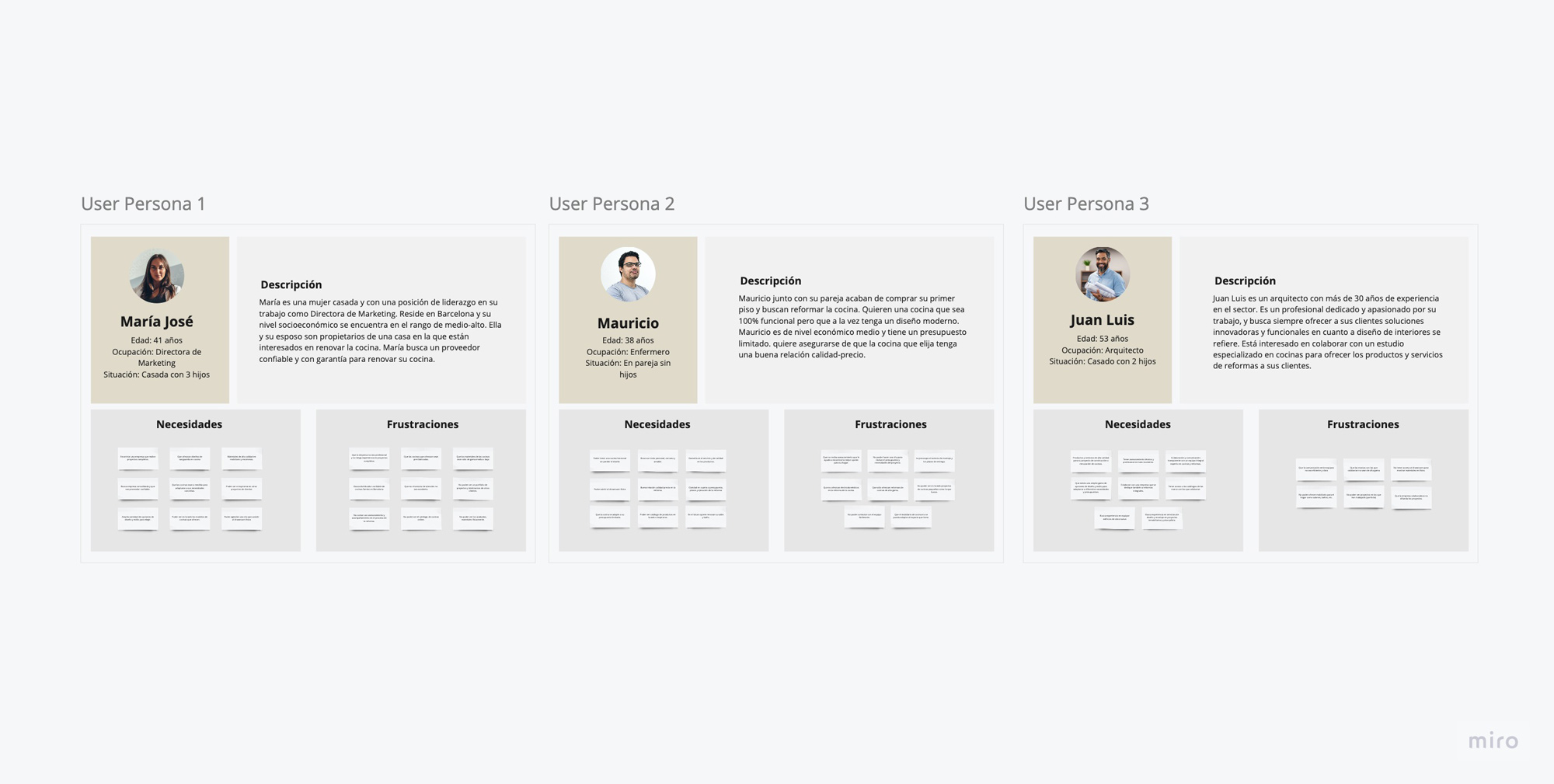
We sent to our client’s marketing team a discovery questionnaire to clarify goals and understand their expectations for this project. This questionnaire has helped us, first of all, to establish a smooth communication with our client. It has allowed us to extract valuable information about their needs and goals, as well as to gather first-hand information about their users to discover how we could improve the user experience.

Business goals

After our client fulfilled the questionnaire, we processed the information and gather insights about the services they offer, differentiate their strengths compared the competition and establish commercial goals, of which we were able to specify the following:

  • Increase brand recognition and presence
  • Reach new markets and upscale their client base
  • Increase kitchen and home furniture sales
  • Acquire more professional partners

Competitor analysis

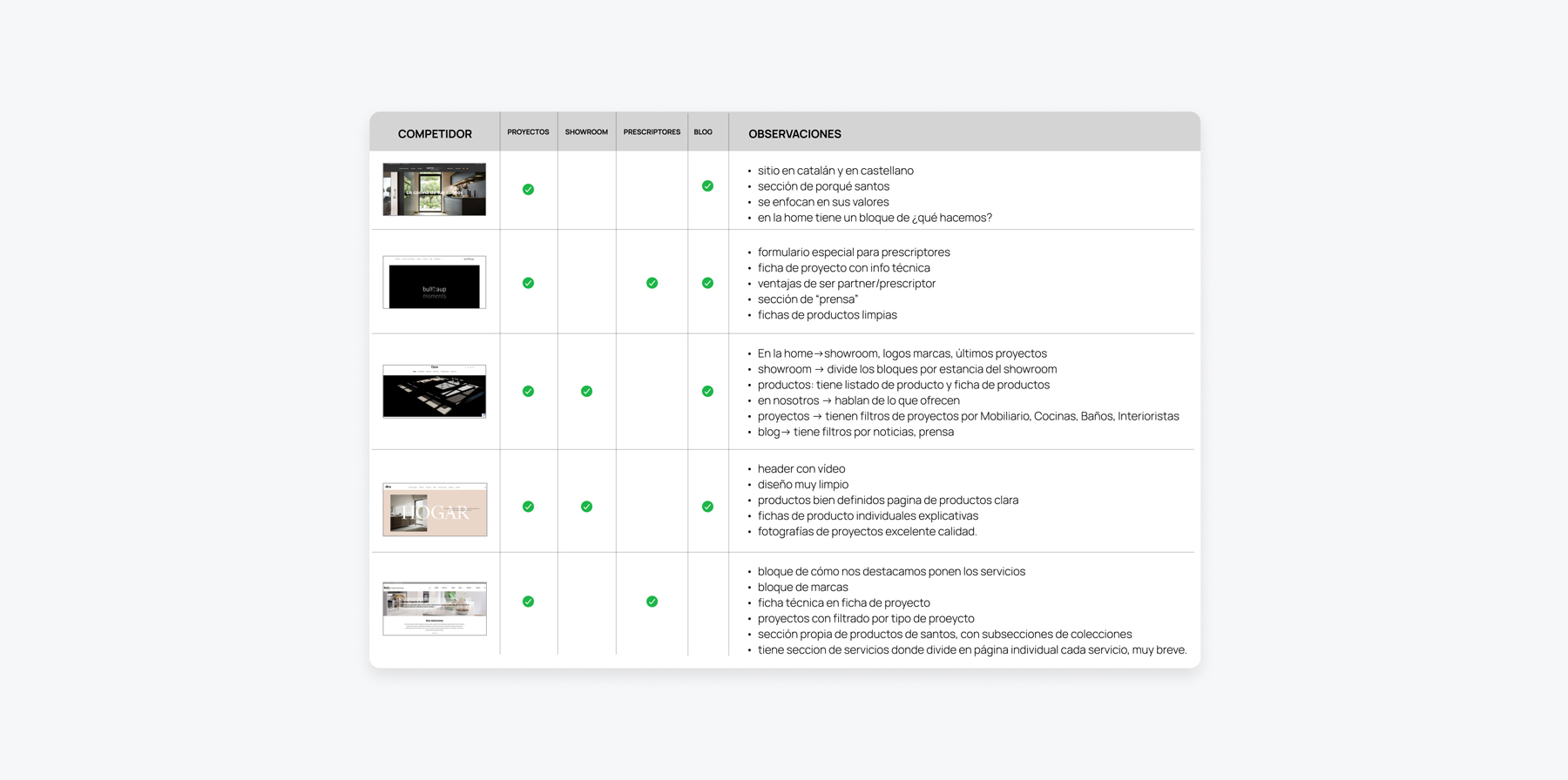
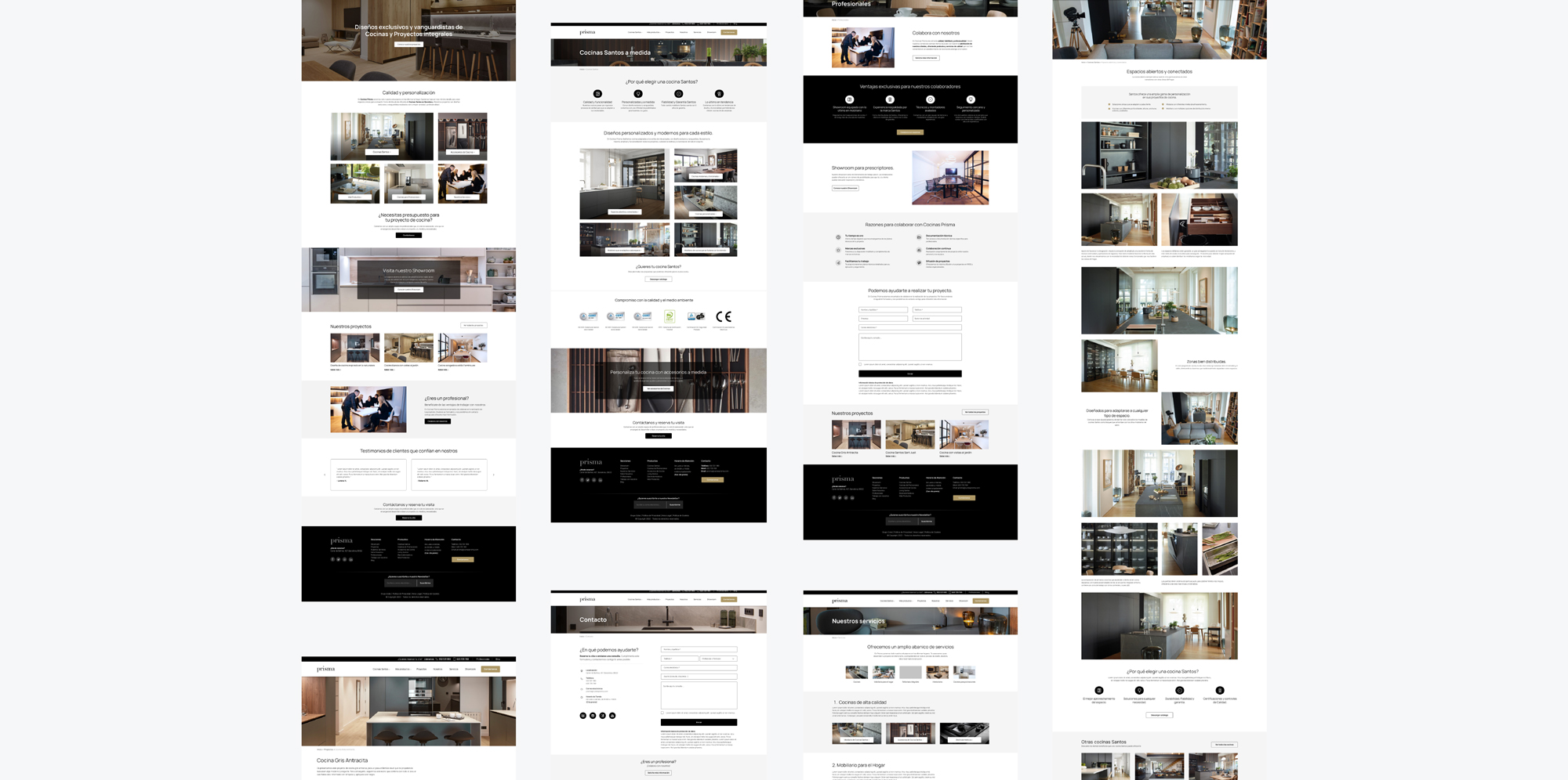
We did an analysis to evaluate the strategies used by our competitors. Key pages were identified, as well as how they presented information about their services, the navigation, and how they engaged their users. Visual aspects, design decisions, and other elements such as the use of images were also analyzed.

2. Definition

User persona

In order to improve the user experience, it was necessary to identify our client’s main target audience profiles. We made a user persona scheme to define different types of users and showcase their needs and understand their frustrations. In this way, we could focus the strategy on a user-centered design.

Empathy map

One of the key steps to understanding your target audience is understanding their desires and emotions. By making an empathy map, it has helped us to get to know our users in depth and to find the value proposition. This meant than we would be able to show and structure the information in the most appropriate and logical way for them.

Defining the problem

We must have an intuitive website where kitchen renovation products and home furniture services can be clearly identified, and where the unique advantages can be visualized and conveyed with more confidence to increase lead and professional partner acquisition, tackle usability errors and problems, showcase more projects, and optimize high-quality images.

3. Ideation

Solution brainstom

A brainstorming session was conducted within our team to quickly generate a large number of ideas. By including different team members in the brainstorming session, ideas and perspectives from people with different experiences could be obtained. This helped us identify opportunities and solutions that had not been considered before. Additionally, we made an importance assessment of all the ideas to help us establish an efficient task prioritization.

User flow

By establishing the user flow, we were able to identify problems and irrelevant pages that implied an obstacle for users in completing their goals. It also helped us identify weak points in the website’s structure, such as pages that had not been created like ‘Services’ page, or the lack of a dedicated kitchen section with their respective product detail page.

Information arquitecture

Establishing the information architecture was a challenge in this project. Our client, offers a wide range of products and services, and required increasing the relevance of their main service: Selling kitchens. At the same time, (and also for SEO positioning reasons), a high presence of the rest of the products and indispensable sections such as projects and showroom needed to be shown. Several internal sessions were established to define the sitemap with the most efficient navigation for our users.

4. Prototyping

Designing the web's structure

· Low Fidelity wireframes

We selected key pages and some new pages to create low-fidelity wireframes. These wireframes have been useful for conducting internal validations and making brief iterations on the structure without wasting too much time and resources. Also served as a visual guide for the client’s marketing team, who due to budget constraints, would be responsible for creating the content and body copy.

· Content strategy
The content strategy was made along the wireframe creation. Since we established a new structure for the whole web, the current content needed to be optimized and new valuable information needed to be added to the new pages while keeping in mind the SEO on-page too.
estrategia-creacion-contenido-proyecto-web

High Fidelity designs

· Style guide

To establish the web’s style guide we based it upon the brand guidelines. It was important to the client to use black as the main color and maintain a minimalist style. The typographic hierarchy was established for both desktop and mobile.

· Key screens design

In the high-fidelity design phase, since we had to optimize time as much as possible due to budget constraints, we selected those main key pages which had essential styles that could be easily replicated on other pages by the development team. In these designs, we have placed elements such as typography, use of images, use of icons, buttons, lists, and form fields to showcase the style and to conduct internal and client validations.

5. Testing

Layout, testings and iterations

Right after we finished the design phase, we moved on to the layout in WordPress. For this project, I was part of the layout team along with two other colleagues.

Once the entire site was laid out, we ran several tests and behavior reviews, checked for usability and navigation errors, and made sure everything met the quality standards we wanted and could be ready for launch.

Bugs and issues identified in this testing phase were addressed and adjustments made.

maquetacion wordpress proyecto estudio

Result

Before & After

Let's work together!

Send me any inquiries, feedback, or comments about my work.