1. Discovery


2. Definition
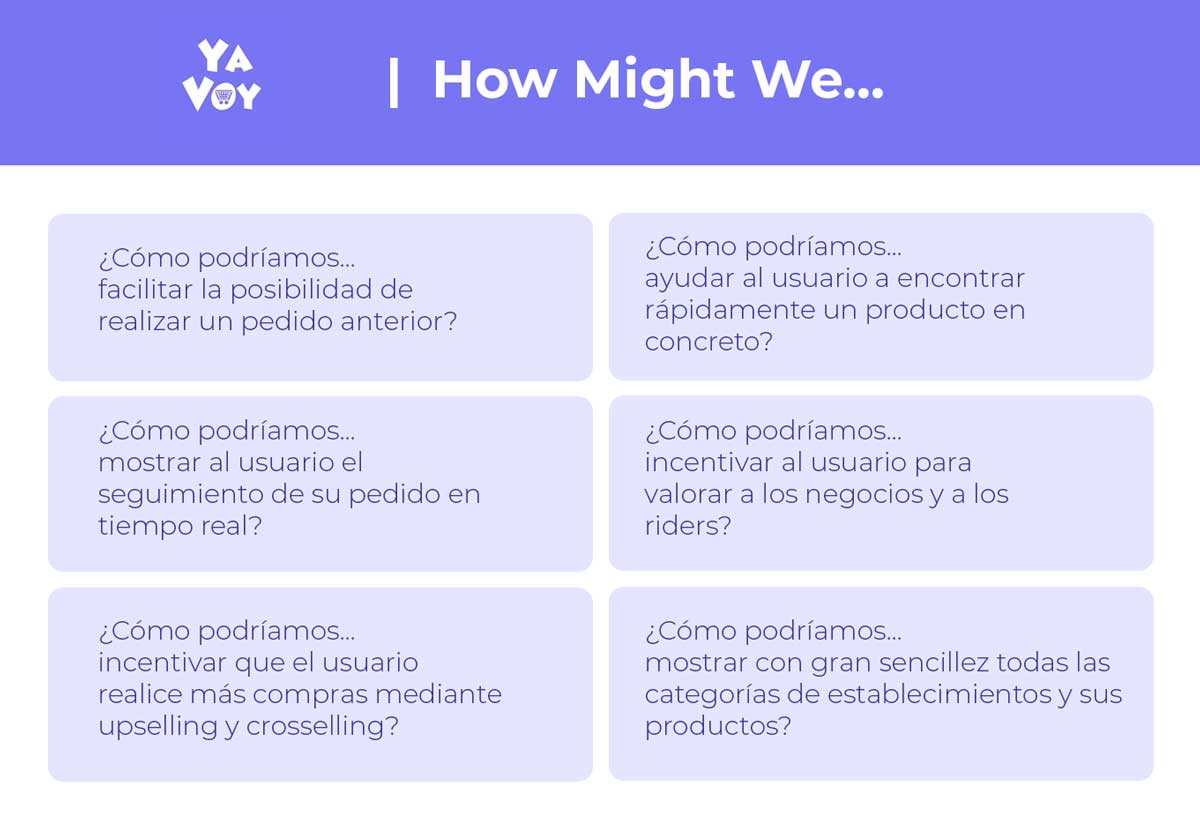
3. Ideation
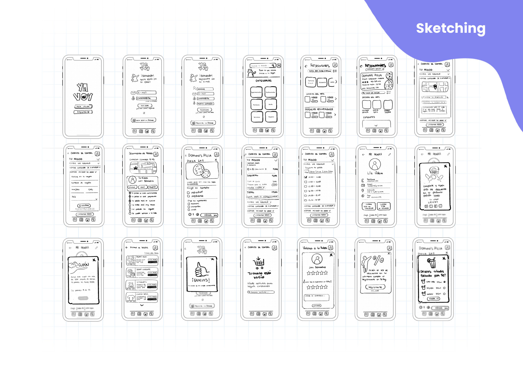
4. Prototyping

5. Testing